At the end of 2017, Packaging Digest shared their predictions for 2018’s biggest design trends in the packaging industry. Packaging Digest predicts saying “ba-bye” to “overly masculine packaging graphics, tiny type and boring colors” and asserts that small consumer packaged goods companies (“small” is defined as those with annual sales of less than $1 billion) will have an opportunity to compete with industry giants.
Packaging design is unquestionably one of the most dynamic, shifting, engaging, and generally “fun” aspects of the packaging industry – Packaging Digest notes design especially is “everywhere you look, and it’s always changing to meet the wants and needs of consumers.” But just like any industry, hot trends cool off, and new ones crop up seemingly out of nowhere.
At 99designs, which bills itself as the world’s largest online graphic design marketplace, self-defined “self-taught designer” Martis Lupus cites 2018’s top ten design trends to keep an eye out for:
Simplicity is one element that pops up on Packaging Digest’s radar, as well:
“Over-cluttered design is becoming a thing of the past, especially as we start to see a broader adoption of minimalism across design categories. Only the most relevant information about the product plays a dominant role in the packaging composition, with a more careful use of white space and colors. As more consumers have come expect product packaging to convey the necessary information instantly, brands have started to adapt.”
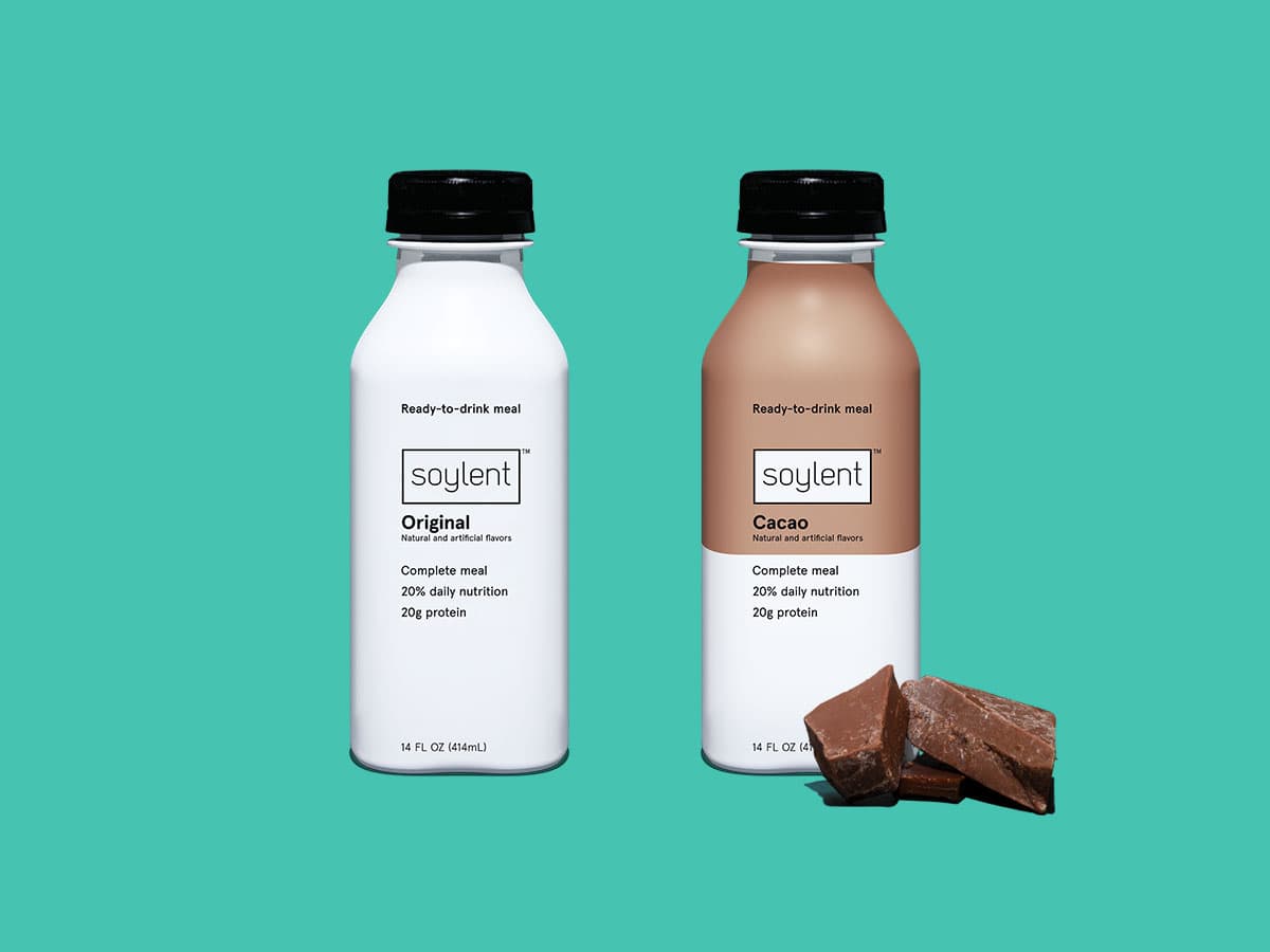
And adapt they have. The minimalist, simplistic look described here is rampant across the industry from food products (think Bay Area tech industry’s meal replacement of choice, Soylent) to cosmetics (buzzy, social-driven millennial makeup company Glossier) to electronics (titan of packaging design’s uppermost echelon, Apple).

Image source: Soylent
These brands not only utilize clean, sans-serif fonts and plenty of white or negative space, they also play with item two on Lupus’ design trend list: pastels. The soft, candy-colored hues are everywhere, including Glossier’s eponymous pink (now dubbed “millennial pink” and officially cemented as a trend of the demographic), eyewear purveyor Warby Parker’s light turquoise and clean grey, and new oral care brand Quip’s fresh, minty green. (Lupus’ third item, Doodles, also find prominence among these brands with Glossier’s pop art-inspired stickers and Quip’s cartoonish iconography).
Another element of contemporary package design that’s popping up on several lists: big words. No, not multisyllabic “ten-dollar” words commonly reserved for spelling bee championships and thesis papers. We’re talking large, bold, clean fonts with concise, simple language.
99design’s Chief Marketing Officer Pamela Webber attributes this to consumers’ ever-shrinking attention spans: “It’s becoming more important than ever for designers and brands to relay their messaging as clearly and as quickly as possible, especially in packaging,” she explains. “In the coming years, we expect to see more brands take this to the extreme by using bold fonts and fewer words to get their message across loud and clear—and stand out on shelves.”
The clearest example of this – cited by both Webber and Lupus – is protein powder brand Eboost. One look at Eboost’s large, bright canisters reads like a major front-page newspaper headline: tall, bold, simple text immediately grabs the consumer’s attention and is nearly impossible to ignore.

Image source: Eboost (via Packaging Digest)
Next up – item six on Lupus’ list – is standout shapes and materials, a packaging design trend Webber calls “extreme packaging – but in a good way.”
“Turning your juice can into a bamboo segment or your resin package into a sheltering tree stump literally means that the only thing left to do is place your logo on the package,” writes Lupus. “No other words required. This method showcases the thoughtfulness and ingenuity your product brings to the market—always something to aim for when building a brand identity.”
Webber agrees, predicting that designers will take more significant creative risks with innovative and whimsical packaging solutions, testing the limits like never before and pushing packing design into new territories. Conversely, she also notes that “recreating the familiar,” a strong trend in packaging design for some time now, will begin to fade away this year.
Familiarity’s fade seems antithetical to this next trend: all things vintage. But Lupus argues: “You can’t go forward without knowing your past.”
“The past is ingrained in our current collective reality, which is why vintage design thrives on us remembering. Throwback design gives us a little something that was left behind: an essential part of our culture or memories.”
Vintage design is also an effective way of demonstrating dedication to a certain level of quality, perhaps unaltered since the inception of the product, decades or centuries back, according to Lupus. “Vintage tells a story of tradition, respect, and passion, elements that remain alive—from a design standpoint—through organized structure, dense details, and strong, lasting identity.”
Examples include Aftelier, designed by San Francisco-based firm Pavement, a studio that defines itself as passionate about crafting strategic packaging and brand identities for wine, spirits, food and luxury goods. Mayfield Gin, designed by Stranger & Stranger, a creative firm specializing in alcoholic beverage package design. Flowering fonts and inky, ornate imagery on paper labels define the vintage aesthetic coming back into vogue and adorning packaging for luxury products.

Image source: Pavement
This next trend is not so much a trend as an imperative: sustainable packaging. Webber writes: “As consumers become more conscientious about the environmental impact of their purchases, more and more brands are opting for packaging and packing material with a much smaller ecological footprint. The cheapest and most accessible materials, like plastics, are being replaced by biodegradable materials, like paper, hemp, starch, and cellulose, and more easily upcycled materials like bamboo and glass.”
FP International is more than familiar with the call for sustainable packaging – it’s our brand’s mission. All of FP International’s air cushion packaging systems create a smaller carbon footprint, help reduce damage claims, and are cost efficient for customers. Sustainability is part of the company’s corporate lifestyle, meaning full integration of long-term environmental, economic and social dimensions into FP International’s business.
Items nine and ten on Lupus’ list go hand-in-hand: holographic effects and vibrant gradients, both eye-catching and trippy treatments and details that make unboxing feel like an experience and make the packaging just as exciting as the product itself. “Pearlescent and metallic materials and holographic foil stamping can render any ordinary box or bag into something that just looks special. This kind of shiny, flashy effect suggests high value and elegance to consumers, and the three dimensionality and depth these materials add to any package bolster this effect.”
Of vibrant gradients, Lupus writes: “Colorful gradients add form and dimensionality to packaging, and a layer of complexity to these designs.” While gradients certainly aren’t new (recall the huge ombre trend overtaking “It Girl” haircolor a few years back), coupling lush, deep colors together and uniting them via a soft, ethereal gradient treatment is definitely fresh.
The next trend on Webber’s list speaks more to the cultural moment we’re living in: gravitating away from hypermasculine, aggressively gendered packaging design in favor of more universal, unisex, non-gendered design elements. Some trends even reflect a more feminine-coded style, including previously mentioned pastels, holographics, and brilliant gradients.
A 2015 Packaging Digest piece by David Luttenberger foreshadowed this 2018 trend: “Just as the notion of what it means to be a man has changed, it’s no longer a matter of slapping a macho message on a brown corrugated or faux leather package and expecting men to buy in… as men become more engaged in such activities as household upkeep and their own personal grooming, brands must make an emotional connection with them.”
But before we get too excited about the potential toppling of the patriarchy and permanent end to elaborate “gender reveal” extravaganzas, read on.
“But at the same time boundaries are blurring, men still want to be recognized as strong, manly and capable,” Luttenberger continues. “For marketers, that’s a delicate tightrope on which they must balance and forge a connection with men by showing that they understand their challenges, as well as their sensitivities to either feminine-leaning products or over-the-top ‘dude-only’ items and messaging.”
We can distill both Luttenberger’s 2015 piece and Webber’s 2018 trend roundup to this: Companies and brands are choosing unisex packaging design over hypermasculine options that traditionally find their way onto popular, tongue-in-cheek “#MasculinitySoFragile” roundups and listicles.
To recap: 2018 will usher in a new era of packaging design, uniting bold type and large fonts with soft colors, vintage imagery, and even special effects and treatments. These trends directly replace their precursors: small, busy fonts are traded for large, concise text; cluttered designs are being scrapped in favor of fresh minimalism with plenty of negative space; familiar packaging solutions have given way to experimental, awe-inspiring shapes and designs; excessive packaging materials are being stripped down in favor of not just trendy but essential sustainable options; and aggressively masculine designs are fading to the back, favoring non-gendered or even feminine design elements.
With so much change happening across the industry this year – in design, in sustainability, and even in social context – we can’t wait to see what next year’s roundup holds.

The European Parliament voted for a complete ban on a range of single-use plastic waste across the union in a bid to stop pollution of the oceans. The proposal also called for a reduction in single-use plastic waste for food and drink containers, including plastic cups.

China has long been treated as our planet’s repository for plastic waste. The nation has accepted 45% of the world's total plastic recycling since reporting to the United Nations Comtrade Database began in 1992.

Even before plastic straw bans grew trendy, California was at the forefront of using less plastic and promoting more sustainable living. California pioneered a statewide ban on plastics beginning in 2016, when the state became the first in the U.S. to ban most stores from providing customers with single-use plastic bags, following a successful referendum. [...]